_31a3beb1-aff4-4cea-8b79-cd982df89a22.png)
Purpose and Overview
While Content 360 focuses on what to publish, Engagement 360 reveals when your audience is most engaged. It aggregates engagement patterns across platforms and highlights ideal posting schedules. This page is particularly helpful for social managers fine‑tuning their publishing calendars.
Components
-
Best Days for Facebook, LinkedIn and X – Cards display the single best day of the week to post on each platform (e.g., Wednesday for LinkedIn). Different networks often have distinct optimal days.
-
Total Followers vs. Total Posts – A chart compares your follower growth to the number of posts published. If follower growth stalls despite frequent posting, content quality or targeting may need adjustment.
- LinkedIn Followers Vs Employee Shares -
The “LinkedIn Followers vs Employee Shares” chart illustrates how employee advocacy contributes to audience growth. Each bar shows the total number of times employees shared company content on LinkedIn in June, July and August 2025, with values plotted against the scale on the right. At the same time, a smaller scale on the left tracks how many LinkedIn followers the company gained during those months.
Even though the follower numbers are much smaller than the share counts—hence the two axes—the trend is what matters: as the green bars rise slightly from June through August, the follower count ticks upward as well. This correlation suggests that when more employees share your posts, new people discover and follow your company page. In other words, increased employee sharing activity helps drive incremental follower growth.
-
Heatmap – Clicks by Hour – The heatmap visualizes click activity by hour of the day across all posts. Darker squares indicate higher engagement. Use this to schedule posts when your audience is most active.
-
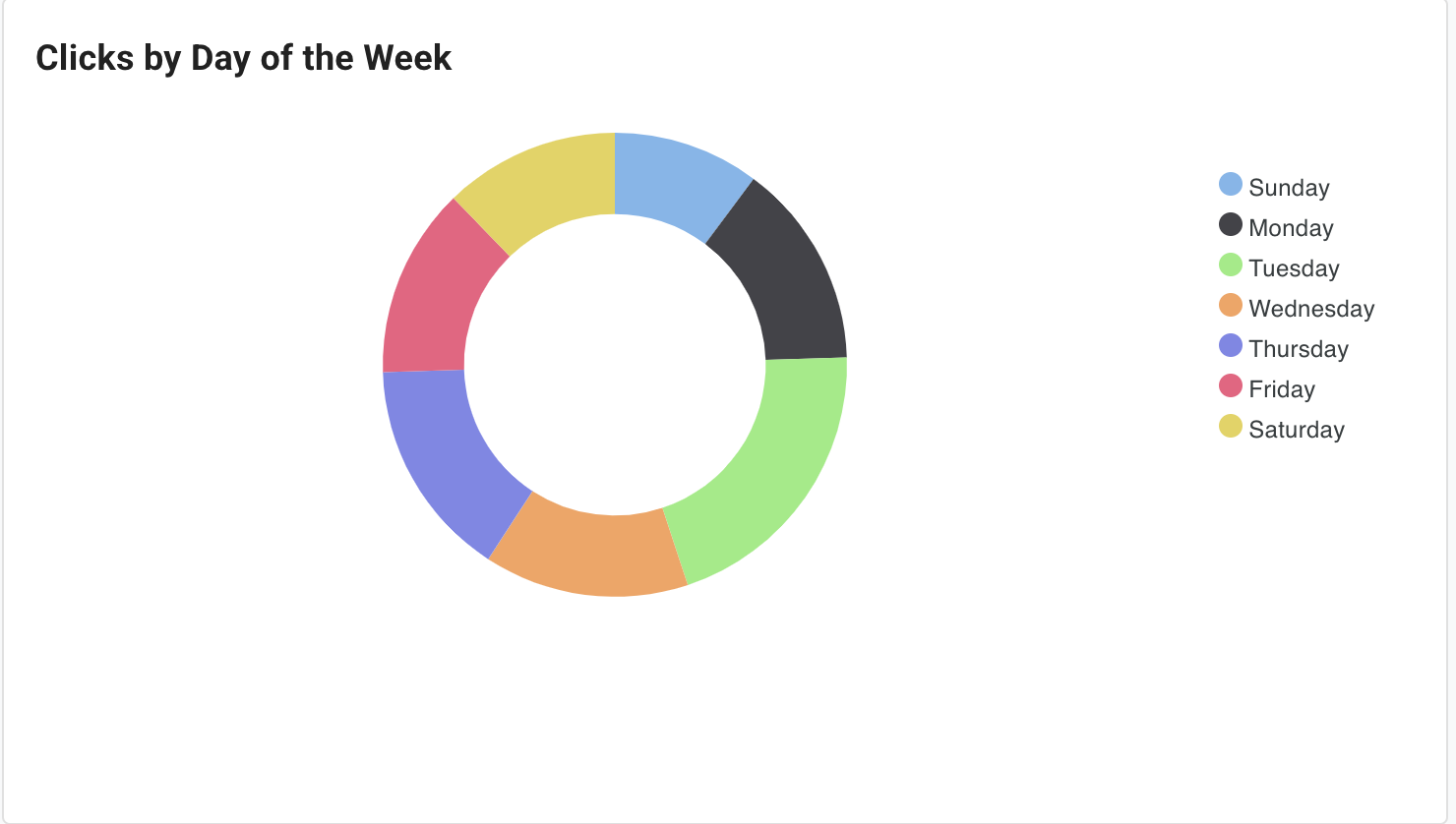
Clicks by Day of the Week (Donut Chart) – This chart shows the distribution of clicks across weekdays. A balanced distribution means your audience engages consistently throughout the week; a skew suggests focusing on specific days.
-
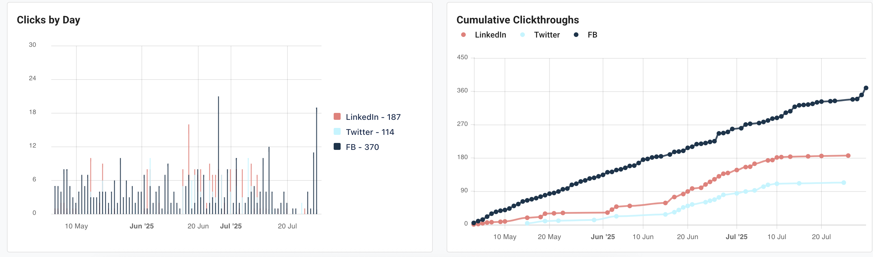
Cumulative Click‑Throughs by Network – A line chart compares the total click‑throughs from each social network. Analyzing this can reveal which platform is performing best and whether cross‑promotional strategies are working.
-
Clicks by Day (Bar Chart) – This bar chart tallies clicks per day, reinforcing patterns seen in the donut chart and heatmap.
Using the Page
-
Determine Posting Days – Schedule more posts on the platform’s indicated best day (e.g., mid‑week for LinkedIn) while testing posts on other days to confirm the recommendation.
-
Optimize Posting Times – Use the heatmap to schedule posts during hours of peak activity. For instance, if the heatmap shows engagement spikes around 10 am PST, plan your posts then.
-
Balance Network Effort – If one network consistently generates more clicks, evaluate whether to increase investment there or adjust content on weaker networks.
-
Cross‑Reference With Content 360 – Pair the best times data with recommended content types. For example, share a datasheet on LinkedIn on Tuesday morning if both pages suggest that combination.